 ownloads Documentation Centre!
Featured Downloads
Introduction
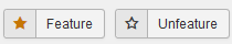
Downloads may be featured just like Joomla! articles with an  symbol. There are eleven 'star' images to choose from. Each has the same shape but has a different colour. Also you may upload your own 'feature' image.
The frontend view of a featured Download is controlled by three placholders in the active layout; {featured_pic}, {featured_class} and {featured_detail_class}. These placeholders are already in the default layouts. Basically the placeholders generate specific code. The {featured_pic} placeholder always adds the selected image in the header setion of the frontend view if the Download is marked as featured. The other two placeholders only generate code if the Download is marked as featured and, as described later, the option 'Use the additional Placeholders' is set to Yes. The {featured_class} and {featured_detail_class} placeholders also need relevant CSS code to be added in say jdownloads_custom.css as describe in more detail later in this article.
symbol. There are eleven 'star' images to choose from. Each has the same shape but has a different colour. Also you may upload your own 'feature' image.The frontend view of a featured Download is controlled by three placholders in the active layout; {featured_pic}, {featured_class} and {featured_detail_class}. These placeholders are already in the default layouts. Basically the placeholders generate specific code. The {featured_pic} placeholder always adds the selected image in the header setion of the frontend view if the Download is marked as featured. The other two placeholders only generate code if the Download is marked as featured and, as described later, the option 'Use the additional Placeholders' is set to Yes. The {featured_class} and {featured_detail_class} placeholders also need relevant CSS code to be added in say jdownloads_custom.css as describe in more detail later in this article.
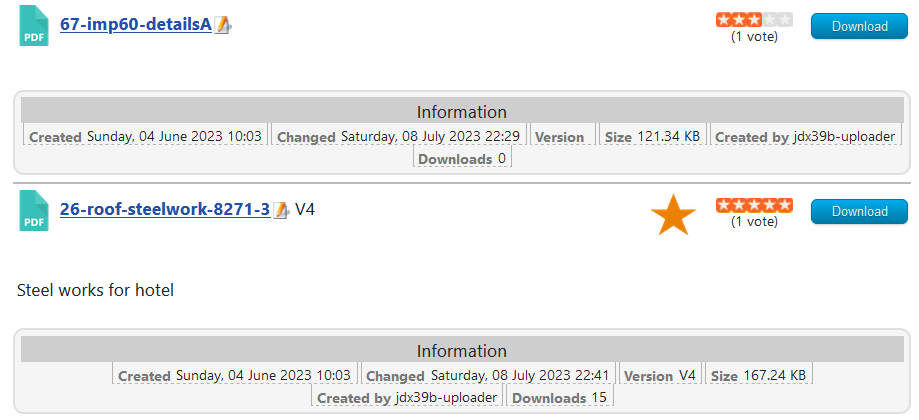
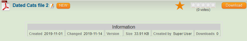
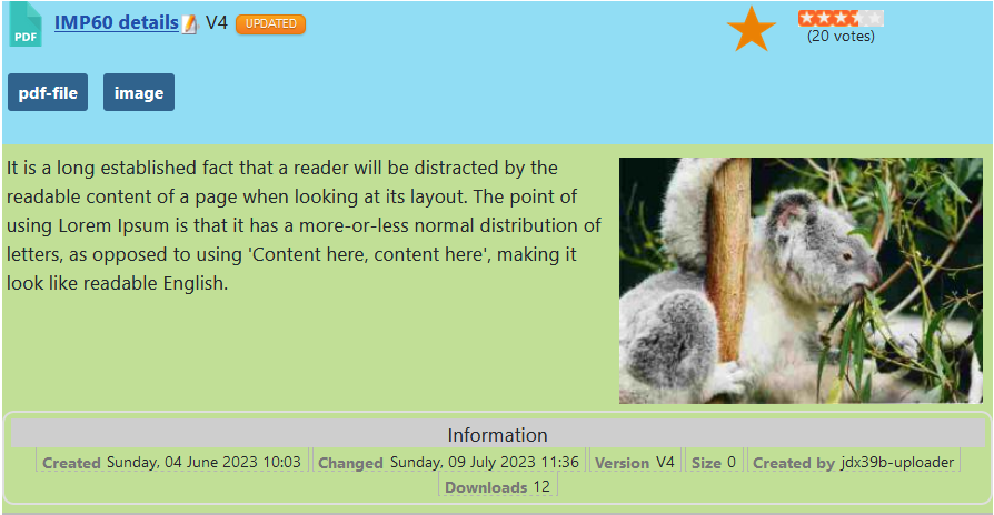
The picture opposite illustrates the simplest level of 'featuring' with just an orange star,, to indicate 'featured'.
The second Download has been featured and the first one is a 'regular' Download.
.
, to indicate 'featured'.The second Download has been featured and the first one is a 'regular' Download.
.
As noted later there are additional styling possibilities to make a featured Download more evident.
Option Settings
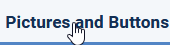
The settings for featured are found in  -
-  tab in the Featured Settings section.
- tab in the Featured Settings section.The first settings allow you to select the symbol itself. The available selections are different coloured stars.
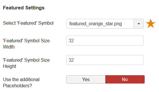
The next two settings select the width and height of the symbol respectively.
The fourth setting allows different views by use or not of background colours.
As illustrated opposite, selecting 'No' will then just show the featured symbol in the title bar.
Assuming that the relevant CSS classes have been setup then selecting 'Yes' could add a coloured background to the featured Downloads to really make them really stand out.
As noted later the colour scheme is changeable using CSS.
Making a Download featured
The next question to answer is how to do you make a Download featured? This is straight forward in either the Frontend or the Backend.
Frontend
In the frontend either whilst editing an existing Download or creating a new one go to the Publishing tab and, using the pulldown, change the Featured option to Yes for 'featured'.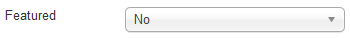
Backend
1. If editing or creating a Download then, in the General tab, change the setting of the Featured option from No to Yes by clicking on the Yes.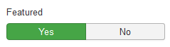
Obviously this is very tedious if you have several Downloads to set to featured.
2. So in the backend on a listing of the Downloads you can select the relevant Downloads by ticking the box next to the title
and then use the Featured button in the toolbar at the top of the page.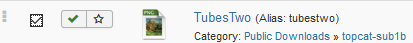
and then use the Featured button in the toolbar at the top of the page.
3. An easier method is to list the Downloads and simply click on the which will change to indicating the Download is now featured.
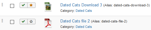
which will change to indicating the Download is now featured.Featured Downloads Standard Appearance
The featured 'star' is shown by the placeholder {featured_pic} in the title section of the view. There are two other placeholders {featured_class} and {featured_detail_class} which may be used to give background colouring to different parts of the Download and Download Details views of featured Downloads.
The standard Downloads and Downloads Details layouts support all three 'featured' placeholders so there is no need to edit the layouts.
The standard Downloads and Downloads Details layouts support all three 'featured' placeholders so there is no need to edit the layouts.
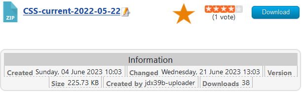
For reference the image opposite is an example of a 'regular' frontend view, that is it has not been marked as featured.
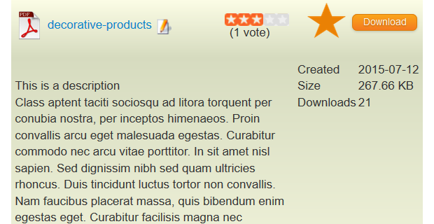
The second image opposite shows a 'featured' views using all three placeholders.
The {featured_class} shows a linear gradient background from
 to
to  . The {featured_class_detail} was selected as the same background colour
  thoughout as the end of the linear gradient.
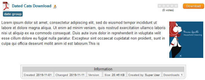
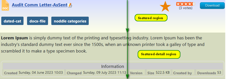
A more obvious difference between the {featured_class} region, shown in blue, and the {featured_detail_class} region shown in green is illustrated opposite.
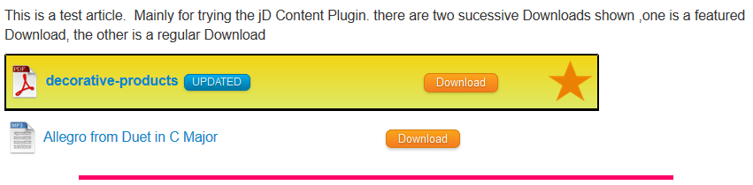
The same effect happens when showing a Download in an article or similar using the Content Plugin and the Content button as illustrated below. The layout used was "Files Layout Single Line" as selected as the default layout for Content in Options - Content Plugin tab.
Changing the Featured Background.
The simplest way to modify the coloured backgrounds from featured Downloads is to add some extra CSS to the jdownloads_custom.css file. There is a article explaining how to edit jdownloads_custom.css so see there for the details Export/Edit/Import (opens in a new window/tab).
The actual CSS code required is itself quite straight forward as noted below. Basically in these examples it is just setting background image colours and linear gradients the CSS code shown. But you could be more adventurous!
The actual CSS code required is itself quite straight forward as noted below. Basically in these examples it is just setting background image colours and linear gradients the CSS code shown. But you could be more adventurous!
In the examples here, the CSS code shown opposite was copied to jdownloads_custom.css to show the first example above.
Note that for the {featured_detail_class} region there are multiple classes involved because of the different CSS in various layouts./* CSS for featured heading region*/
.jd_featured {
background-image: linear-gradient(0deg, #feffe8, #d6db6f)!important;
}
/* css for featured detail region */
.jd_featured_detail,
.jd_featured_detail .jd_minipic_wrapper,
.jd_featured_detail .jd_fields_wrapper_compact,
.jd_featured_detail .jd_fields_wrapper {
background: #d6dbbf !important;
}
To get just single colours as in the second example above then copy the CSS as shown opposite into jdownloads_custom.css./* CSS for featured heading region*/
.jd_featured {
background-image: #91ddf4 !important;
}
/* css for featured detail sections */
.jd_featured_detail,
.jd_featured_detail .jd_minipic_wrapper,
.jd_featured_detail .jd_fields_wrapper_compact,
.jd_featured_detail .jd_fields_wrapper
{
background: #c1df96 !important;
}
.jd_featured {
background-image: #91ddf4 !important;
}
/* css for featured detail sections */
.jd_featured_detail,
.jd_featured_detail .jd_minipic_wrapper,
.jd_featured_detail .jd_fields_wrapper_compact,
.jd_featured_detail .jd_fields_wrapper
{
background: #c1df96 !important;
}
Adding Own feature symbol
You can also use your own symbols by uploading them as png files with either FTP or the web site control panel into directory /images/jdownloads/featuredimages.
It should have a name like featured_yellow_rose2.png and should be 64px wide and 64px high. Note that the pull down list is ordered alphabetically.
It should have a name like featured_yellow_rose2.png and should be 64px wide and 64px high. Note that the pull down list is ordered alphabetically.
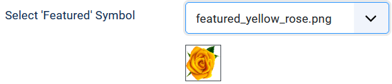
Inselect the tab. Tthe option "Select 'Featured' Symbol" will now include the extra symbol in the pull down list.
The frontend view will now look something like that shown opposite.

select the tab. Tthe option "Select 'Featured' Symbol" will now include the extra symbol in the pull down list.The frontend view will now look something like that shown opposite.
ColinM Nov 2019, updated July 2020, July 2023