Introduction
There are a large number of Options in the Pictures and Buttons tab. Many of these are very similar so in this article not all idividulal options are noted.
Options have been put into appropriate main sections and subsections as indicated in the index.
To access click on the Joomla Control panel click on the button, then on the
  button. Next click on the
  then click on the
 button at top right. Finally click on the
  tab.
tab.
Options have been put into appropriate main sections and subsections as indicated in the index.
To access click on the Joomla Control panel click on the
button, then on the button. Next click on the then click on the button at top right. Finally click on the tab.Symbols
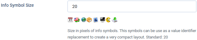
icon symbols
There is only one option for icon symbols, 'Info Symbol Size' with a default value of 20 pixels.
The image opposite shows some of the symbols that are available.
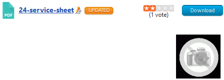
In the front end a typical view could be as shown opposite.
Note that mini-images are only shown if there is information in the relevant field.
A hint is shown if you hover the mouse over a symbol.
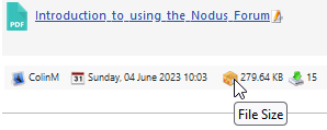
The available information mini-images are: licence
 ; author
  ; author_url ; created_date
  ; language
  ; system
  ; downloadable file size
  and number of times downloaded
  . Note author and author_url have the same mini-image.
It is of course necessary that the active Downloads layout supports showing the mini-images.
Presently the only one is 'Standard Files Layout'.
To add mini-image support the layout needs to have code such as shown opposite.
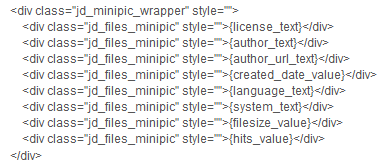
Presently the only one is 'Standard Files Layout'.
To add mini-image support the layout needs to have code such as shown opposite.
Category symbols
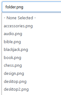
The Option 'Default Symbol for Categories' has a pulldown to allow selection of which image symbol will be shown in the frontend if one has not been set explicitly when creating or editing a category.
The othe two options set the height and width. There are approximatlely 30 different symbols, a few are shown below.
 .
.
The othe two options set the height and width. There are approximatlely 30 different symbols, a few are shown below.
.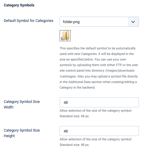
If the sizes are changed then the symbol category shown above will also change to the sizes that will be shown in the frontend.
This also applies to the other symbol images who will change to their specified size (file, featured and 'no-image' symbols).
This also applies to the other symbol images who will change to their specified size (file, featured and 'no-image' symbols).
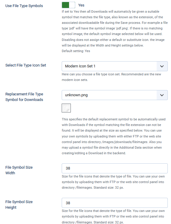
File symbols
The File Type symbol settings offer five options as shown opposite.
If you select No for the 'Use File Type Symbols' option then the other four options are not shown.
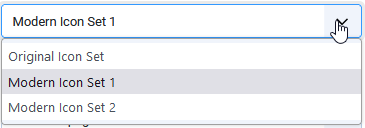
As shown below there are 3 sets of Icon symbols that may be selected as the default set.
 As an example the pdf symbols for each set are:
'original': 'modern1':
 'modern2':
 .
.
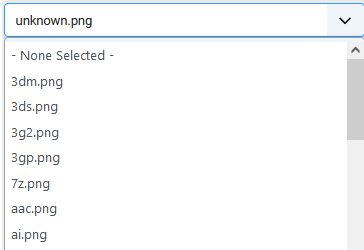
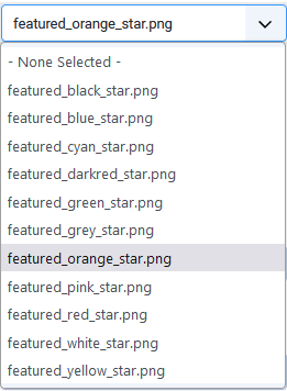
The pull down for option 'Replacement File Type Symbol for Downloads' has a very long list of file types that one may select as the default as illustrated below.
If you select No for the 'Use File Type Symbols' option then the other four options are not shown.
As shown below there are 3 sets of Icon symbols that may be selected as the default set.
As an example the pdf symbols for each set are: 'original':
'modern1': 'modern2':.The pull down for option 'Replacement File Type Symbol for Downloads' has a very long list of file types that one may select as the default as illustrated below.
The image selected is only used if jDownloads does not recognise the file type of the downloadable file.
That is jDownloads will use best endeavour to automatically show the appropriate image that corresponds to the file type.
That is jDownloads will use best endeavour to automatically show the appropriate image that corresponds to the file type.
Featured symbols
When creating of editing a Download in the frontend then it may be marked as featured by setting option 'Featured' in the Publishing tab to Yes. In the backend there are three methods, the simplest is by clicking on the unfeatured symbol,  , in the backend Downloads listing Featured column which will then show as
  .
.
More details of this any other aspects of 'featuring' a Download are given in a separate article Featured Downloads. (opens in a new window/tab).
, in the backend Downloads listing Featured column which will then show as .More details of this any other aspects of 'featuring' a Download are given in a separate article Featured Downloads. (opens in a new window/tab).
The symbol that denotes a featured Download is by using the pulldown in the 'Select 'Featured' Symbol' option which has a choice of Stars in many different colours.
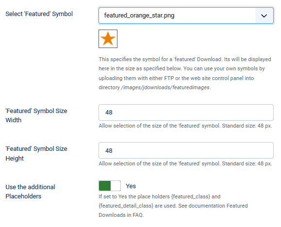
You can also use your own symbols by uploading them as png files with either FTP or the web site control panel into directory /images/jdownloads/featuredimages.
Obviously the size of the symbol is selected in the two options 'Featured' Symbol Size Width and 'Featured' Symbol Size Height.
The frontend view of a featured Download is controlled by three placholders in the active layout; {featured_pic}, {featured_class} and {featured_detail_class}. Basically if the Download is marked as featured then the placeholders generate specific code. The {featured_pic} placeholder effectively adds the selected image. The other two placeholders only generate code if the option 'Use the additional Placeholders' is set to Yes and the Download is marked as featured.
As noted above more information is give in the Featured Downloads article (opens in a new window/tab).
Buttons
In the jDownloads 3.9 series and higher the Buttons are all defined by CSS statements in file 'jdownloads_buttons.css'.
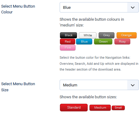
Header Menu buttons
Use the pulldown in the 'Select Menu Button Colour' option to choose one of the avilable colours.
The size is selected using the pulldown list in the 'Select Menu Button Size' option.
Download buttons
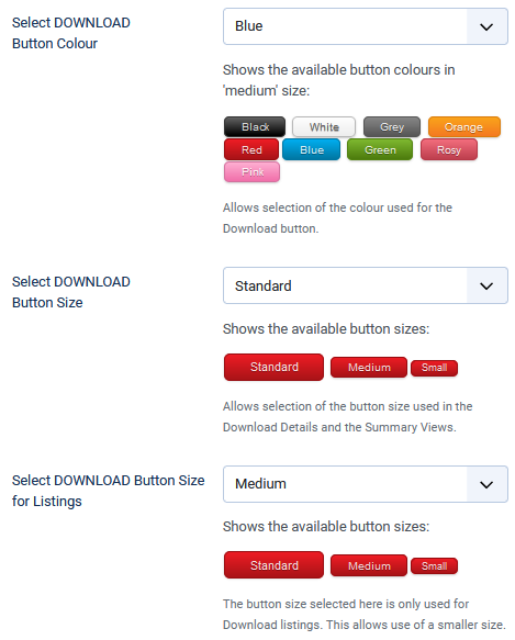
Setting the button colour is set by using the pulldown in the 'Select DOWNLOAD Button Colour'.
There are two size specifications.
1) The 'Select DOWNLOAD Button Size' option is used in Download Details and Summary views.
2) The option 'Select DOWNLOAD Button Size for Listings' option allows setting a different size when listing Downloads. This allows for a smaller size to be used.
Mirror site buttons
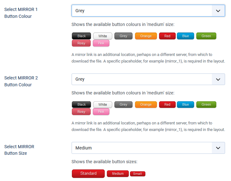
Options 'Select Mirror 1 Button Colour' and 'Select Mirror 2 Button Colour' allow independant choice of colour for the MIRROR buttons.
Both MIRROR buttons are the same size as specified in option 'Select MIRROR Button Size'.
Use Icomoon Characters
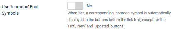
The option "Use 'Icomoon' Font Symbols" default is No.
When set to No the symbols are as shown below.
 But when set to Yes each button has a relevant symbol added before the text as illustrated below.

When set to No the symbols are as shown below.
But when set to Yes each button has a relevant symbol added before the text as illustrated below.Hot, New, Modified buttons
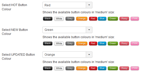
These three options select which colour is used for the Hot, New and Updated buttons respectively.
Note that the size of the buttons is not selectable.
Settings
Hot, New, Modified settings
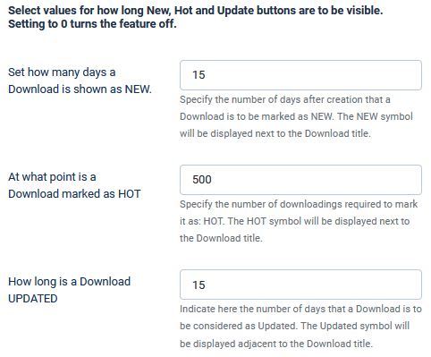
These options are the trigger points of how long or when to show the symbol.
The option 'Set how many days a Download is shown as NEW' means that the New symbol will be shown for the specified number of days after the creation date.
Option 'At what point is a Download maked as HOT' is a little different. For example when set to 50 it means that the Hot symbol is shown when there have been 50 or more downloads.
For the lable
 to show in the Frontend obviously the option 'How long is a Download UPDATED' has to be set to an integer number of days.
As noted below an additional option also has to be set before it is shown. This because the change might be a minor correction of say a spelling error in the description. Hence it is not always a 'real' update of the content.
As the software does not intrinsically know that the edit is a 'real' update then either:
1) in the Frontend edit view set the 'Has it been Updated?' option in the tab to Yes;
or
2) in the backend tab set option
 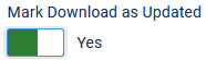 of the current Download to Yes.
If either of the above is set to Yes then the Updated symbol will be shown for the specified number of days.
1) in the Frontend edit view set the 'Has it been Updated?' option in the
tab to Yes;or
2) in the backend
tab set option of the current Download to Yes.If either of the above is set to Yes then the Updated symbol will be shown for the specified number of days.
Image thumbnail settings
When a picture is uploaded as part of a Download then this set of options allows it to be made into a thumbnail.
As part of the Download one or more images may be added to the Download to give a better idea of the content of the downloadable file.
As part of the Download one or more images may be added to the Download to give a better idea of the content of the downloadable file.
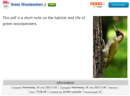
As an example the Download might have a downloadable pdf file that is all about green woodpeckers.
Clearly adding an image of a green woodpecker would better illustrate the subject matter.
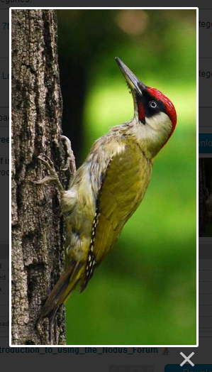
Clicking on the image gives a larger scale view as illustrated on the far right.
To achieve this jDownloads uses the GD Library, which is normally part of the services provided by the majority of web site hosting.
If the GD library is present then jDownloads shows a message . If it is not available then a message with a red backgroud is shown.
jDownloads makes the thumbnails to the specified size when the Download is created or an image is added during editing. This avoids the delay when viewing with 'on demand' scaling.
If the GD library is present then jDownloads shows a message
. If it is not available then a message with a red backgroud is shown.jDownloads makes the thumbnails to the specified size when the Download is created or an image is added during editing. This avoids the delay when viewing with 'on demand' scaling.
The first option, 'Create Thumbnails from uploaded Pics' has to be set to Yes to create the thumbnails.
Note also if the downloadable file is itself an image file then when the Download is created, a thumbnail will also be created.
When option 'Use this also for Auto Monitoring' is Yes then any images files found during the automonitoring will also have thumbnails created.
The next four options set the size, in pixels, of the thumbnails and the main image itself when displayed in the front end.
Note that the aspect ratio of the image is preserved as the sizes are the maximum, that is the largest dimension of the image will set the scaling.
Setting the final option 'Remake all Thumbnails' to Yes and clicking on
  or
or  will recreate the thumbnails at the required size.
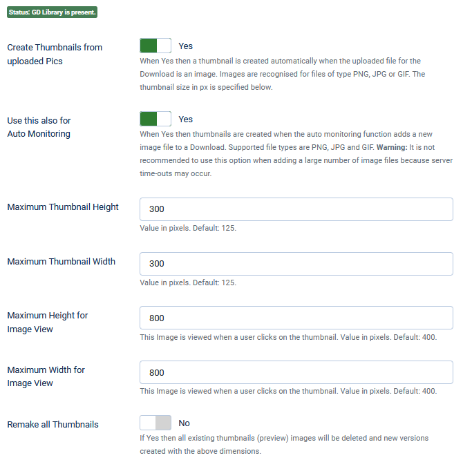
Note also if the downloadable file is itself an image file then when the Download is created, a thumbnail will also be created.
When option 'Use this also for Auto Monitoring' is Yes then any images files found during the automonitoring will also have thumbnails created.
The next four options set the size, in pixels, of the thumbnails and the main image itself when displayed in the front end.
Note that the aspect ratio of the image is preserved as the sizes are the maximum, that is the largest dimension of the image will set the scaling.
Setting the final option 'Remake all Thumbnails'
to Yes and clicking on or will recreate the thumbnails at the required size.When the process is completed jDownloads will automatically reset the option to No and give a completion message such as 
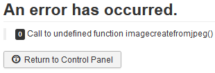
NOTE If both the GD Library and Imagick are missing, that is if both  and
and
 are showing then jDownloads will report an error when trying to re-create the thumbnails.
and are showing then jDownloads will report an error when trying to re-create the thumbnails.Resize fails to complete
In some rare situations the thumbnail resizing fails to complete. This is generally due to a mismatch between the php.ini settings where the memory_limit is smaller than the post_max_size or the upload_max_filesize settings.
The memory_limit setting should be larger than the largest of either post_max_size or upload_max_filesize.
The memory_limit setting should be larger than the largest of either post_max_size or upload_max_filesize.
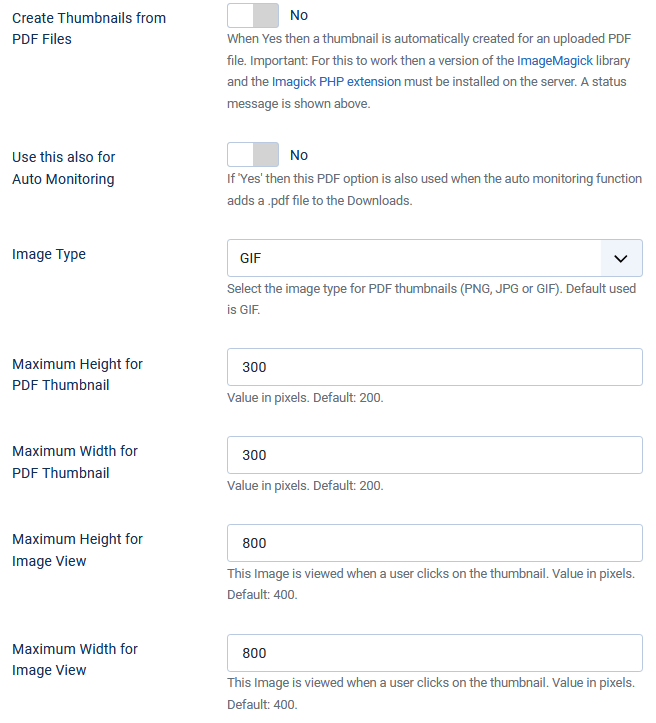
PDF thumbnail settings
If the downloadable file is a pdf file then the Imagick module will make a thumbnail of of the first page of the pdf if the option 'Create Thumbnails form PDF Files' is set to Yes.
The default setting is No.
Most of the other options are just like those as described in the Image Thumbnail settings except 'Image Type' which allows choice of the type of thumbnail and there is no 'Remake' option.
The resultant image is usually good if it is from say a front cover but is generally less satisfactory if the first page is detailed.
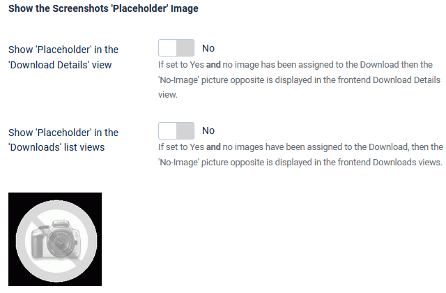
Screen shot settings
The default for options 'Show Screenshot images in the Download Details view' and 'Show Screenshot images in the Downloads views' is Yes.
When set to Yes then any images associated with the Download will be shown provided that the active Layout includes showing screenshots.
Layouts that show screenshots include code such as illustrated below. Note: the actual <div class... varies in different layouts - the neccessary part is that between {screenshot_begin} and {screenshot_end} .
 If there are no images and the above conditions are met then the 'No-Image' image as illustrated opposite is shown in the frontend view.
The 'frame' of the 'No-image' image is transparent so if you have a pale green coloured background then the image appears as:
.
Layouts that show screenshots include code such as illustrated below. Note: the actual <div class... varies in different layouts - the neccessary part is that between {screenshot_begin} and {screenshot_end} .
If there are no images and the above conditions are met then the 'No-Image' image as illustrated opposite is shown in the frontend view.The 'frame' of the 'No-image' image is transparent so if you have a pale green coloured background then the image appears as:
.
ColinM July 2020, updated October 2021, July 2023, May 2025
